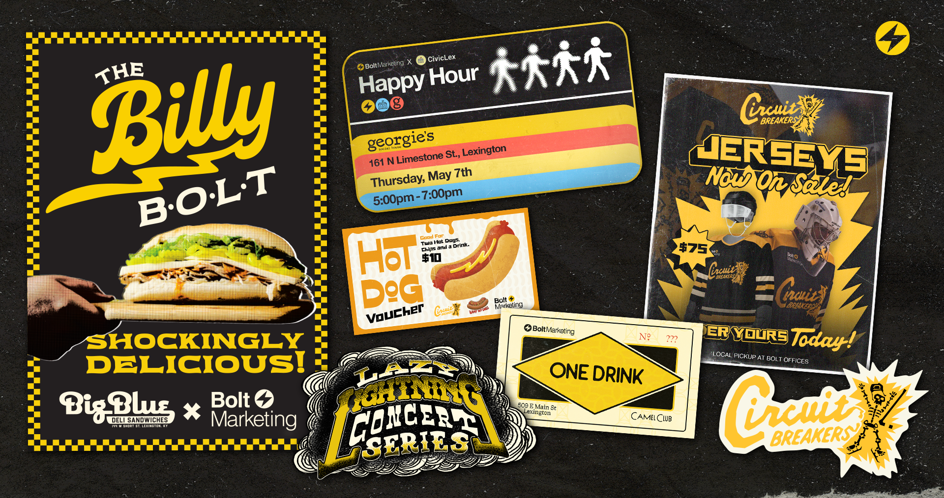
Color Crash Course: Using Color in Your Brand
Color Crash Course: Using Color in Your Brand

Color is an essential aspect of brand design. The colors you choose for your brand have the power to evoke emotions, communicate your message, and make a lasting impression on your audience. Understanding Color Theory can help you make informed decisions when it comes to choosing the right colors for the face of your business. But, before we discuss applying color to your brand identity, let’s take a look at some Color Theory basics.
What is Color Theory?
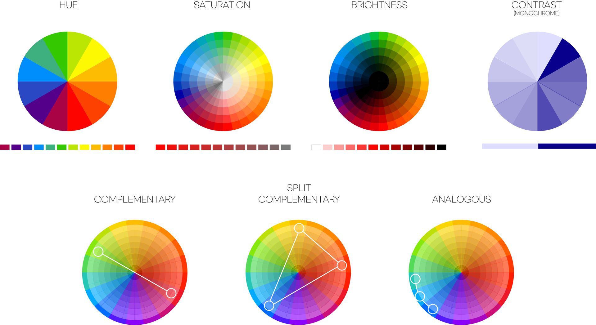
Color Theory is a set of principles that explain how colors work together and how they can be used to influence different moods and emotions. It includes the study of color hues, saturation, brightness, contrast, and harmony. There are three primary colors: red, yellow, and blue. All other colors are derived from them and the words below help explain how these colors are described.
Below are some helpful terms we use to describe color:
- Hue: Hue refers to the actual color itself, such as red, blue, or green. It's what we typically think of when we think of color.
- Saturation: Saturation refers to how intense or pure a color is. Highly saturated colors are vibrant and intense, while desaturated colors are more muted and subdued.
- Brightness: Brightness refers to how light or dark a color is. A bright color is lighter and more white incorporated, while a dark color has more black incorporated and is more somber.
- Contrast: Contrast refers to the difference between colors. High contrast means that two colors have a significant difference in brightness or hue, while low contrast means that the colors are similar.
- Harmony: Color harmony refers to the way that colors work together in a design. When colors are harmonious, they create a pleasing and unified visual experience. Different color harmonies include complementary, analogous, and monochromatic color schemes.
Color Psychology
Color psychology is the study of how colors affect human behavior and emotions. Different colors can evoke different emotions and reactions in people. For example, red is often associated with passion, energy, and excitement, while blue is associated with calmness, trust, and professionalism. Color psychology has been used in marketing, advertising, and design to create specific moods or emotions in the viewer. By understanding the psychology of color, you can make informed decisions when choosing colors for your designs and marketing materials that evoke specific emotions and achieve their desired outcomes.
Color is Subjective
Color is a subjective experience that is relative to the viewer. The way we perceive color is influenced by a number of factors, including our genetics, environment, and cultural background. The lighting conditions and surroundings in which we view colors can affect our perception of them. Additionally, cultural associations with color can influence the way we interpret and respond to different colors. As a result, creators must be mindful of these differences when selecting colors for their designs, and consider how their target audience may perceive and respond to those colors.
Using Color in Brand Design
Here are some ways you can use color in your brand design:
1. Consider your brand's personality
The colors you choose for your brand should reflect your brand's personality. Are you a fun and playful brand, or a serious and professional brand? Different colors can help communicate different personalities. For example, bright and bold colors are often associated with playful and energetic brands, while muted and neutral colors are often associated with more serious and professional brands.
2. Use color to communicate your message
Color can also be used to communicate your brand's message. For example, if you're a green energy company, you might use shades of green to communicate your commitment to sustainability and the environment. Similarly, a wellness brand might use calming colors like blue and green to communicate relaxation and balance.
3. Create a color palette
Creating a color palette is a great way to ensure consistency across all of your brand's materials. Your color palette should include your primary colors, secondary colors, and any accent colors you might use. A good rule of thumb is to use no more than four or five colors in your palette.
4. Consider color contrast
When using multiple colors in your design, it's important to consider color contrast. Contrast helps ensure that your design is legible and easy to read. For example, if you use a dark background, you’ll need to use light text to create a clear contrast.
5. Test your colors
Finally, it's important to test your colors in different contexts to ensure they work well together. Consider how your colors look on different devices, in different lighting conditions, and in print materials. It’s also important to understand several types of color codes that designers and developers use to identify and specify colors accurately across different platforms and devices. Here are some of the most common types:
- RGB: RGB stands for Red, Green, Blue. It's an additive color model used in digital devices to create a wide range of colors. In this model, colors are created by combining red, green, and blue light in different intensities. RGB color codes are expressed as three numbers between 0 and 255, representing the amount of red, green, and blue in the color.
- CMYK: CMYK stands for Cyan, Magenta, Yellow, and Key (black). It's a subtractive color model used in printing to create a wide range of colors by subtracting light from white paper. CMYK color codes are expressed as percentages of each color, with 0% representing no color and 100% representing full color saturation.
- HEX: HEX codes are six-digit hexadecimal codes used in web design to represent colors. Each digit represents a value between 0 and 15 in the RGB color model. For example, the HEX code for pure red is #FF0000.
- HSL: HSL stands for Hue, Saturation, and Lightness. It's a cylindrical color model that specifies colors based on their hue, saturation, and brightness. HSL color codes are expressed as three values between 0 and 360 (for hue) and 0% to 100% (for saturation and brightness).
- Pantone: Pantone colors are a standardized color system used in printing and graphic design. Each Pantone color has a unique code, making it easy to reproduce colors consistently across different platforms, devices, and printable surfaces.
Understanding these different color codes can be helpful for designers and developers to ensure accurate and consistent color representation across different mediums.
Who knew that so much goes into color? Color Theory is a powerful tool in brand design. Understanding the psychology of color and how colors work together can help you create a strong and effective brand. When choosing colors for your brand, consider your brand's personality, message, and the emotions you want to evoke. But, don’t forget that color is subjective. Knowing the rules of Color Theory can help you effectively break them. By creating a well thought-out color palette and testing your colors in different contexts, you can create a memorable and impactful brand that resonates with your audience.