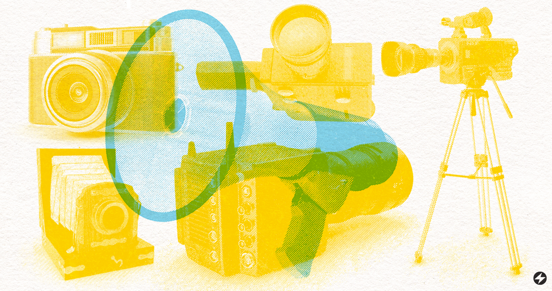
The Perfect Pair: Helping Your Brand Find its Typeface.
The Perfect Pair: Helping Your Brand Find its Typeface
You’ve been dreaming of starting your own business or rebranding what you currently have. The visuals assets like colors and logo icons are coming together but you are getting overwhelmed by the countless font options you have to choose from. Don't let all the work you put into dreaming about and designing your brand go to waste with a bad typeface pairing. Your brand’s typeface is one of the most important elements in communicating who you are to your audience. It’s a visual representation of your brand’s personality and can greatly impact how people perceive what you do. With so many options to choose from, it can be a daunting task to find the perfect typeface for your brand. But don’t worry! With a few pointers, you’ll be on your way to finding a typeface match made in heaven. Here are some steps to help you find the perfect typeface for your brand:
1. Determine your brand’s personality
The first step to finding the perfect typeface for your brand is to determine your brand’s personality. Are you a traditional, elegant brand or a modern, tech-savvy brand? Knowing your brand’s personality will help you narrow down your options and find a typeface that best represents your brand. Companies going for a modern look typically use typefaces with clean lines like sans serifs while more traditional industries typically use serif fonts.

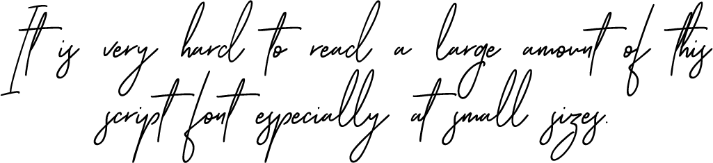
2. Consider legibility
Legibility is key when it comes to finding the perfect typeface for your brand. You want to make sure that your typeface is easy to read, even at smaller sizes. Consider how the typeface will look on different devices and in different contexts, and make sure that it remains legible in all of these scenarios.
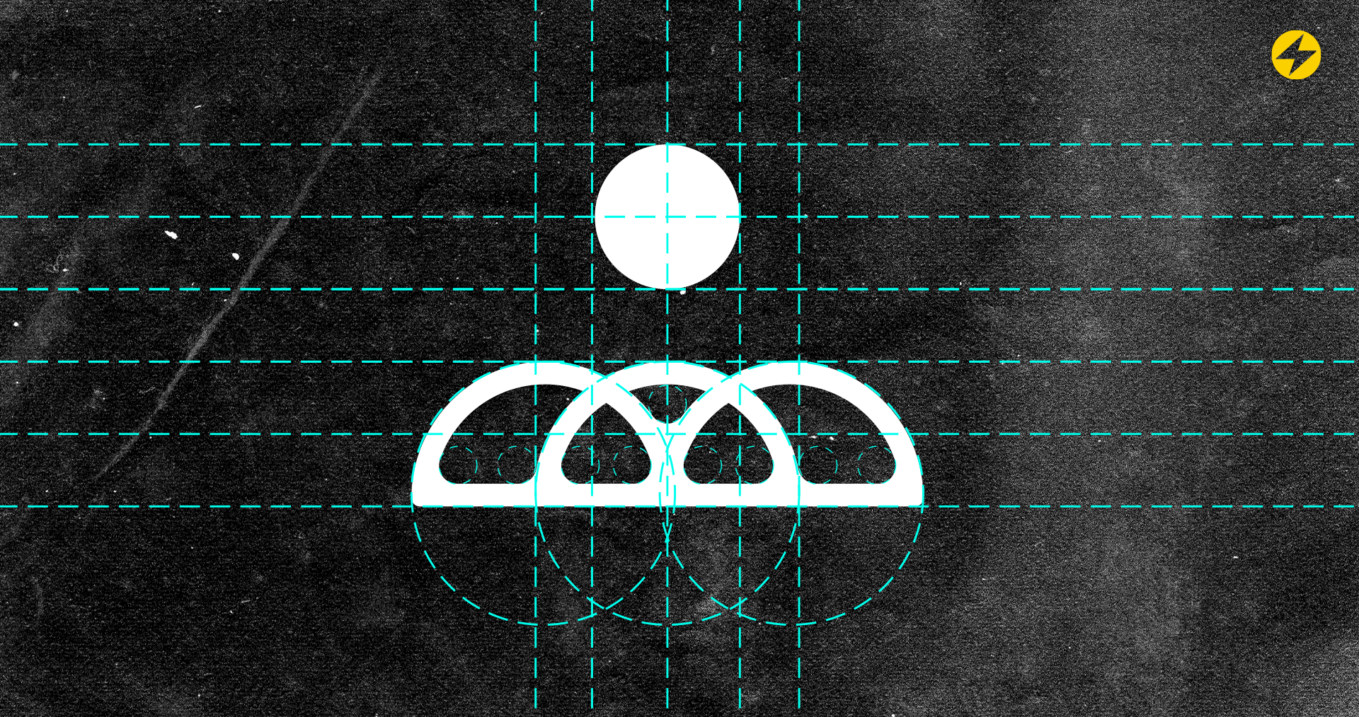
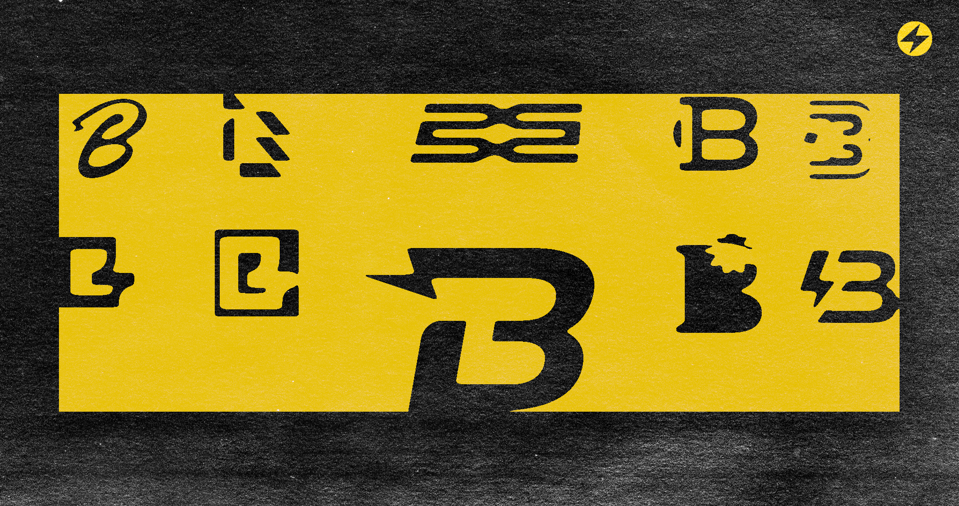
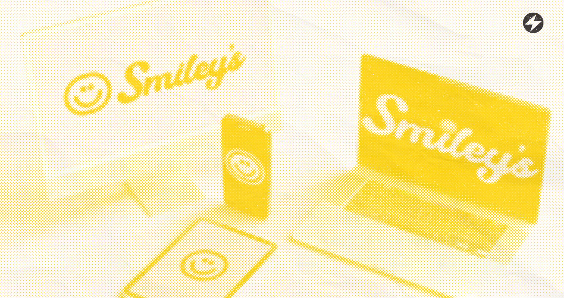
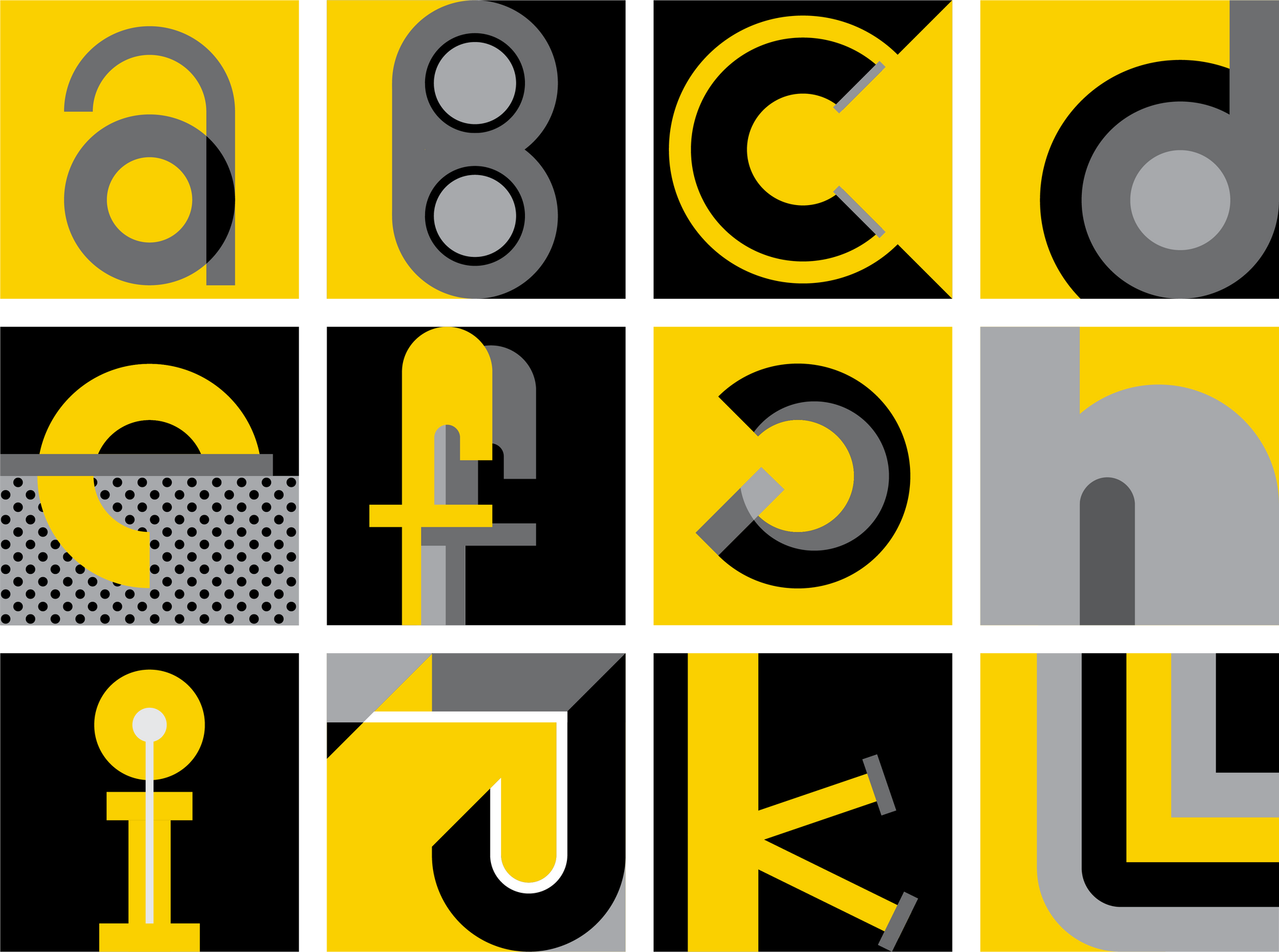
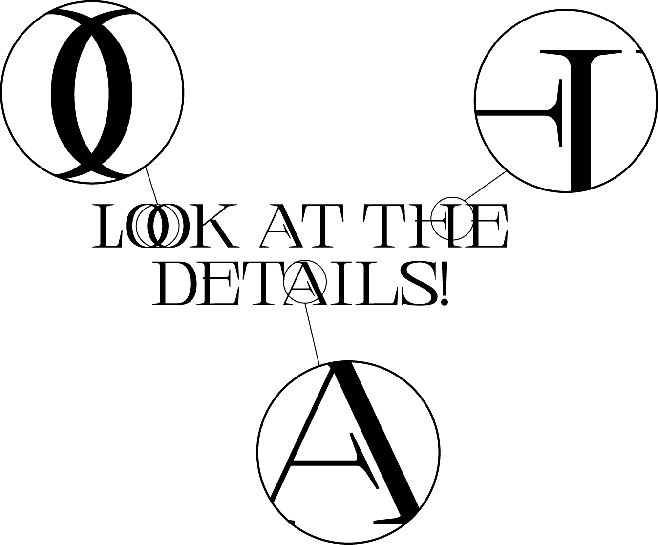
3. Look at the details
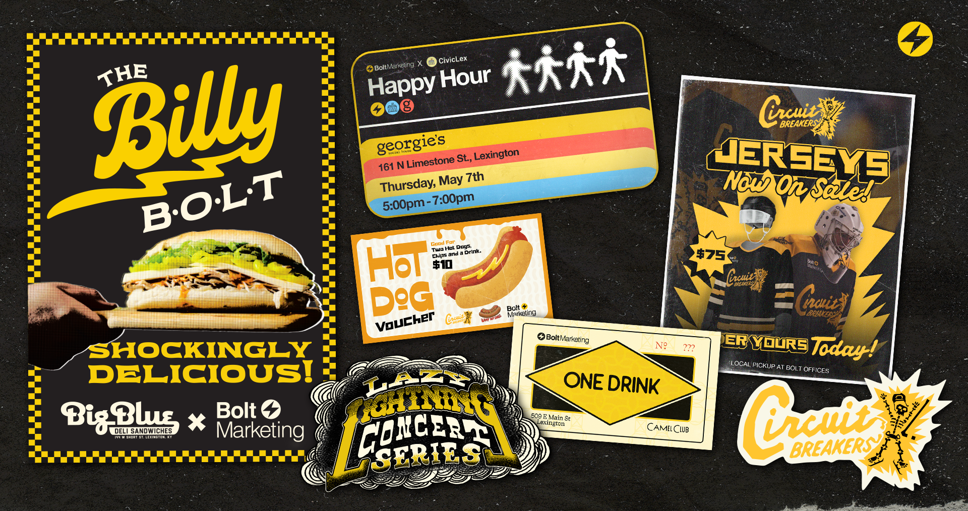
It’s the small details that make a big impact when it comes to finding the perfect typeface. Take a close look at the letterforms and how they connect to one another, the spacing between letters and words, and the overall look and feel of the typeface. For example Luxury brands often us type styles with long soft curves that suggest traditional elegance and timelessness (Rolex and Rolls-Royce for example) while modern brands in tech and industrial business use heavier type styles to show robust stability and strength (Amtrak, CAT, Fedex).
4.Pair typefaces carefully
Using multiple typefaces can be a great way to add visual interest to your brand’s materials, but it’s important to pair them carefully. Make sure that the typefaces complement one another and don’t clash. A good rule of thumb is to use two typefaces max, one for the body copy and one for the headlines.
Let’s use Google Fonts to illustrate some popular typeface combinations:
- Serif and Sans-Serif: It’s common and traditional to use a serif font for the body copy and a sans-serif font for the headlines. For example, Georgia and Montserrat or News Reader and Arial.
- Script and Sans-Serif: A script font can add a touch of elegance to your design and works well when paired with a clean sans-serif font. For example, Pacifico and Open Sans.
- Display and Sans-Serif: Display fonts are great for headlines and can add visual interest to your design. Pairing a display font with a sans-serif font creates a harmonious balance. For example, Rockwell and Work Sans.
- Display and serif: A display font can add a touch of personality, while a serif font can provide a classic and sophisticated look. For example, Baskerville and Lobster.
It's important to keep in mind that these are just guidelines and it ultimately comes down to personal preference and the overall aesthetic you're trying to achieve. The most important thing is to make sure the two fonts complement each other and don't clash, but also contrast enough to create a good visual hierarchy.
5. Experiment with different options
Don’t be afraid to experiment with different typefaces. Try out a few options and see how they look in different contexts. Take a look at how the typeface looks in both digital and print materials and make sure it works well in both. Refer back to our previous points to judge whether a typeface is right for your brand.

6. Choose a versatile typeface
Finally, choose a versatile typeface that can be used across all of your brand’s materials like signage, print material, and in digital assets. This will help ensure consistency and make it easier for you to create cohesive and professional-looking materials.
Now that you have a better understanding of what to look for when finding the perfect typeface for your brand, it’s time to go get ‘em tiger! There are so many great typeface resources, including
typography blogs,
typeface libraries, and font-finding tools. Take your time and find the perfect typeface that best represents your brand and communicates your message to your audience. Finding the perfect typeface for your brand is an important step in building a strong and recognizable brand. Remember to consider your brand’s personality, legibility, details, pairing options, and versatility when choosing a typeface. With these tips, you’ll be well on your way to finding the perfect typeface that will sweep your brand off its feet. Good luck!